
Introduction
What is TIBCO Spotfire? The analytics tool allows users to combine data in a single analysis and get a holistic view of the same with an interactive visualization. TIBCO Spotfire software makes businesses smart, delivers AI-driven analytics, and makes it easier to plot interactive data on maps.
The platform helps businesses transform their data into powerful insights with ease and in less time. It speeds up data analysis across an organization for faster, confident, and much accurate decision-making.
Our goal is always to get insights from our data by providing meaningful visualizations towards our users. However, the way how we’re representing the insights is an important aspect too.
The TIBCO Community has created a wiki page on which you can find interesting information about visual design best practices. You are able to optimize the visual design of your Spotfire analysis using the custom themes, pre-prepared color schemes and using HTML in Spotfire Text Areas.
Dashboard Design
“A dashboard is a visual display of the most crucial information needed to achieve one or more objectives; consolidated and arranged on a single screen so the information can be monitored at a glance.”
Dashboards are a unique and powerful way to present data-based intelligence using data visualization techniques that display relevant, actionable data as well as track stats and key performance indicators (KPIs). Dashboards should present the data at a glance with the most relevant information and through an understandable way towards the end users.
A dashboard can be categorized into different types such as Analytical, Strategic, Operational, Tactical dashboards. The type of dashboard you need should be determined by the user roles and needs you to seek to satisfy.
For example: an operational dashboard presents data deviations to the user quickly and clearly to help them to be proactive and efficient. A analytical dashboards provide the user with at-a-glance information used for analysis and decision making. They are less time-sensitive and not focused on immediate action. The goal is to help users make the best sense of the data, analyze trends and drive decision making.
Overall, the dashboard should be effective and provide you insights in a clear and intuitive way. Using visualizations to compare one or many values sets is so much easier than looking at numbers in the grid.
There are some guiding principles for visualizations but even the positioning of your visualizations on your dashboard is an important aspect. When designing a dashboard, it’s important to follow some kind of organizing principle. One of the most useful ones is the inverted pyramid.
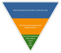
This concept originated from the world of journalism, and basically divides the contents of a news report into three, in order of diminishing significance:
- the most important and substantial information is at the top,
- followed by the significant details that help you understand the overview above them
- and at the bottom you have more background information, which will contain much more detail and allow the viewer to dive deeper into the data
A practical example to apply this principle: a news item has a headline, subheading and a detailed description.
The following screenshot shows you a dashboard that has been designed in TIBCO Spotfire. The design is minimalistic and it’s focusing on the visual aspect of the visualizations.
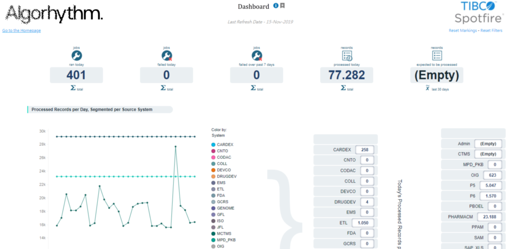
You will notice that the corporate branding and some additional features have been integrated in the design. They will be explained in one of the following blog posts.
Summary
Impressive right? Yes, even in TIBCO Spotfire you can define your own customizations by using the custom theme settings, applying stylesheets to your visualizations and many more.. We will share our best practices and tips & tricks soon in one of our following blog posts. Stay tuned!