
Introduction
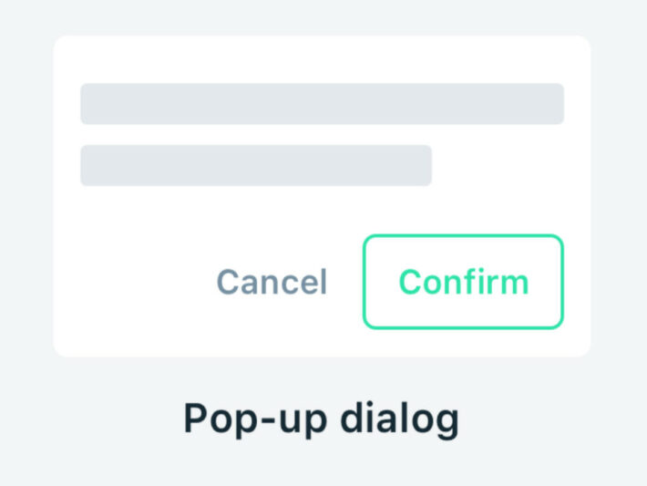
A pop-up window is usually a small window that opens in the foreground of the visual interface without the user selecting “New Window” from a program’s File menu.
Pop-up menus provide quick access or information which doesn’t need to be visible from the first sight.
Description
So far, I haven’t found one single person that is a big fan of documentation. With that reason we tried to find a solution and bring the most important information into the TIBCO Spotfire dashboard.
It can be very useful to store some information as for example business requirements, business calculations or logic close by the analysis. The advantage of this is that the documentation can be consulted very easily and unclear items can be clarified very quickly without searching for the documentation.
You can show this information in a banner at the top of your analysis but it’s nicer and cleaner to hide this extra information behind a button or in our case an icon. The end user can access the information if needed and can ignore it if he doesn’t have any questions about the shown data.
Another case to use a pop-up is to hide for example some functionality. In our previous blog post about TIBCO Spotfire bookmarks, we described a feature to only include a few components by creating a new bookmark. It can be nice to hide this functionality in a pop-up and show it by clicking on an icon. With this approach is the feature available in the dashboard but doesn’t take space if the end user doesn’t use bookmarks.
Implementation
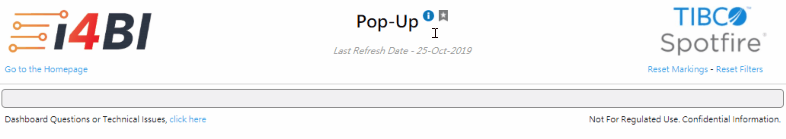
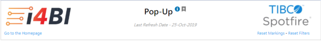
We will hide additional visualization information behind an icon. The information appears by clicking on the ‘i’ icon.
Note: A pop-up can also be implemented by clicking on a link or button instead of an icon.
Step 1: Insert an image in a text area. You can style the image and play around with the size by using CSS. At the end, the pop-up appears by clicking on the icon.
Step 2: Create an <a> tag around the image with a href link to the id of the div section which will contain the pop-up information. In this case “openPopupInformation”.
--------------------------
//Name: openPopupInformation
//Description: This html block will create a href link around the image
--------------------------
 <a href="#openPopupInformation" >
   <img src="<your image location>" style="vertical-align: top; height: 15px; weight: 15px;"/>
  </a>
Step 3: Create the pop-up view in the same text area which will contain the extra information about the visualizations. The div tag contains the same ID as referenced in the href from the <a> tag (openPopupInformation).
All HTML and CSS properties can be used in the pop-up. You can create a table, insert images, style the content, … .
--------------------------
//Name: openPopupInformation
//Description: This html block contains the content of the pop-up div
--------------------------

<div id="openPopupInformation" class="modalDialog">
 <div>
  <a href="#close" title="Close" class="close">X</a>
  <h2>Information Box</h2>

  <p>Lorem ipsum dolor sit amet, consectetur adipiscing elit. Aliquam ultrices blandit blandit. Duis commodo luctus nibh eu feugiat. Morbi consectetur ullamcorper sollicitudin. Aenean hendrerit metus at justo fringilla viverra. In venenatis velit lectus, in aliquet enim rutrum a. Suspendisse ut ligula erat. Vestibulum at sagittis nisi. Nunc molestie convallis pretium. Aliquam erat volutpat. Maecenas et tortor ullamcorper, sodales ligula id, posuere nulla. Quisque fermentum euismod augue sit amet laoreet.</p>
 </div>
</div>
Step 4: The class “modalDialog” makes sure that the div tag “openPopupInformation” is hidden by default and only appears by clicking on the icon. If you remove the “modalDialog” class, then you will notice that all the information from the “openPopupInformation” div appears under the icon and there is no pop-up effect.
--------------------------
//Description: This css file contains the input of the pop-up div class to show and hide the pop-up
--------------------------
<style>
 .modalDialog {
   position: fixed;
   font-family: Microsoft JhengHei, Arial, Helvetica, sans-serif;
   font-size: 11px;
   top: 0;
   right: 0;
   bottom: 0;
   left: 0;
   background: rgba(0,0,0,0.8);
   z-index: 99999;
   opacity: 0;
   -webkit-transition: opacity 400ms ease-in;
   -moz-transition: opacity 400ms ease-in;
   transition: opacity 400ms ease-in;
   pointer-events: none;
   overflow-y: auto;
 }

 .modalDialog:target {
   opacity: 1;
   pointer-events: auto;
 }

 .modalDialog > div {
   width: 900px;
   position: relative;
   margin: 5% auto;
   padding: 5px 20px 13px 20px;
   border-radius: 10px;
   background: #fff;
}

 .close {
   background: #606061;
   color: #fff;
   line-height: 25px;
   position: absolute;
   right: -12px;
   text-align: center;
   top: -10px;
   width: 24px;
   text-decoration: none;
   font-weight: bold;
   -webkit-border-radius: 12px;
   -moz-border-radius: 12px;
   border-radius: 12px;
   -moz-box-shadow: 1px 1px 3px #000;
   -webkit-box-shadow: 1px 1px 3px #000;
   box-shadow: 1px 1px 3px #000;
 }

 .close:hover { background: #00d9ff; }
</style>
Summary
Business requirements or nice features can be stored in a pop-up window which appears by clicking on an icon. This is a clean and easy approach to give end users access to extra information without taking unnecessary space at the page.