

Introduction
Imagine you are walking through a factory and in front of you are 3 machines producing bolts for construction. Above each machine where the bolts come out is a screen showing the bolt defects-per-million-opportunities of the current shift, current week, and weekly values for the past year. I would think, generally, people would make the connection that these visualizations are showing how well those machines are performing and, if there was an issue, it would be clear which machine needs calibration to reduce the number of defects.
These performance measures could also be separately placed in a reporting dashboard online and labeled for the viewers as machine 1 defects, machine 2 defects, and machine 3 defects. In this situation, extra effort needs to be made by the viewer to translate what they are seeing into what it means in the real world. Which machine in the factory is machine 1? What products are the defects related to?
Why are you telling me this?
My point here is not that online dashboards are bad, especially as applying other visualization principles could easily answer the above questions. Instead, my point is that there is a tangible benefit to providing data visualizations in a context that makes them more understandable. By making it easier for viewers to fully grasp what a visual shows, their effort can then be redirected to focus more on deriving insights and determining what to do next.
However, contextualizing a data visualization should be looked at as one tool of many and should be applied when necessary: do not think the above examples means that the solution to your problems is to duct tape iPads to your customer service representatives so everyone can see that Tim resolved more support issues than Stefanie while they walk around the office.
I don’t want more screens around my workplace
Physically contextualizing a data visualization is not the only way this can be done. This is a very flexible concept, it could be done by placing a visual immediately after a video explanation, or using graphics to complement the visuals, or probably other things that I’m not thinking of while I’m writing this.
The example of this principle that inspired me to write this article was actually a Tableau visualization that showed the layout of a distribution center and with visuals embedded throughout showing various KPIs related to how things were going. While I can’t show you that, I’ve made a demo dashboard where I tried to apply this principle.
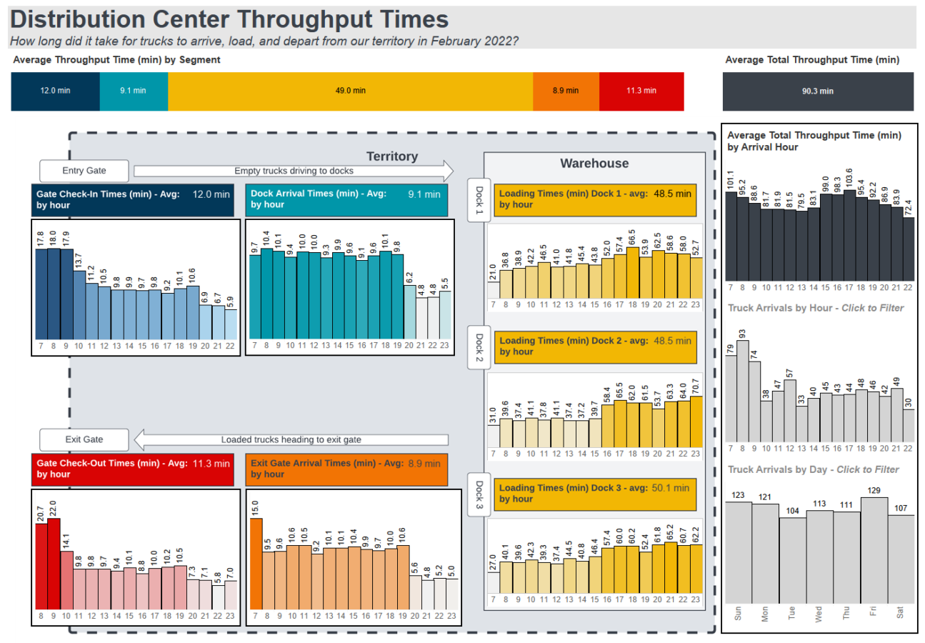
A couple of thoughts on what I tried to accomplish with the dashboard:
- To use the title and subtitle to give the overall message of what is being looked at
- To arrange the various charts so the sequential nature of them are clear
- To use images to complement the arrangement of the charts
- To place totals and summary figures on the edges, outside of the physical flow diagram to distinguish that they aren’t representing a step in the process
- To allow users to find potential bottlenecks in the process and when they are occurring
Conclusion
A core purpose of creating data visualizations is so people do not need to struggle reading through data tables to try to find insights. There are many principles you can use to provide a better experience to users looking at data like use of color, chart selection, interactivity, fonts, arrangement, etc. Even after you have the “perfect” chart, you should consider how to be most effective with how and where you are presenting it to the end user.