
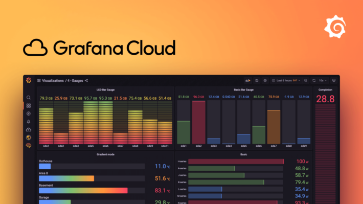
In this blog post we are going to explore the online tool Grafana. Grafana is the ideal tool to visualize real time or live data that is accessible in an online dashboard.
As example I will be using mockup data to demonstrate how Grafana can be used. In this case I will simulate weather data via the plugin ‘TestData DB’ which should come installed with all Grafana accounts. In this tool we can easily simulate data and also tailor this data to our needs via some parameters.
A new beginning
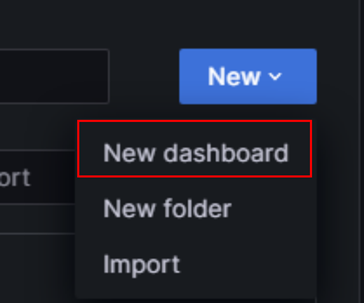
We will begin with creating a new dashboard, this can be done by selecting “dashboards” where you can then simply select the new option -> new dashboard.
Creating the connection
From here we can start setting up our environment which then later can be used to create our visuals.
The first and most important thing to set up next is the data source. This datasource will contain all the data that we want to visualize. In this example I will show a dummy data source which will generate data that we can tailor to our needs via parameters.
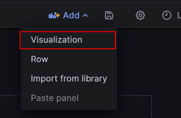
To start configuring the data source click the add visualization button. You will be redirected to a popup where you can select the instance you want to connect to. Because our data source isn’t yet configured, select “Configure a new data source” on the bottom right.
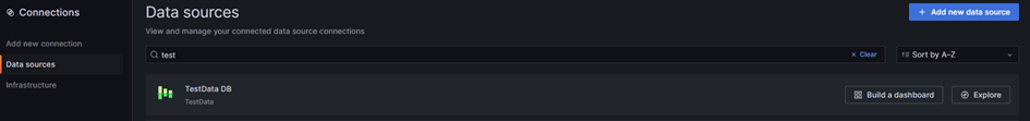
You will see an overview of all available data sources. To create the TestData DB connection simply search for test and the TestDataDB wil show up like here:
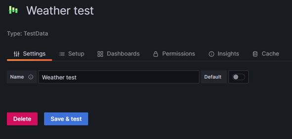
Once you select TestData DB, you will be taken to the configuration of the data source. The only thing we still need to do for now is change the name.
Now click the save&test button. The data source will be created and if everything went right you should see the popup telling the data source is working.
Congrats! the data source is now up and running!
You can always access the data source in de data sources menu.
Creating the dashboard
Now that the data source is up and running, we can get started with visualizing the data.
To use the data source, search for the name you have given it and it should appear. To start visualizing the data, click the add new panel block. To add more panels you can select the add panels button on the top right of the screen.
A new screen will pop up with an empty panel. From this screen we can fully customize the dashboard. We will not be seeing every functionality in this example but feel free to experiment!
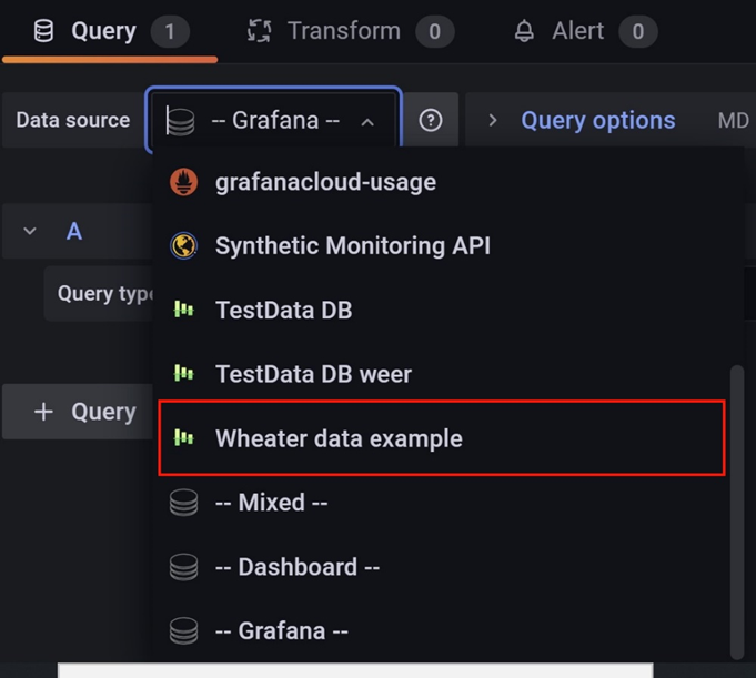
Now its time to select our newly made data source and start exploring the data:
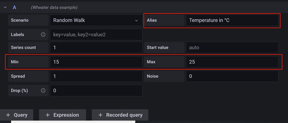
After selecting our data source, we can start changing the parameters to get the data we want. In this example I am trying to get an somewhat realistic depiction of the temperature. Here I only change the min and max value to 15 and 25 and renamed the alias to Temperature.
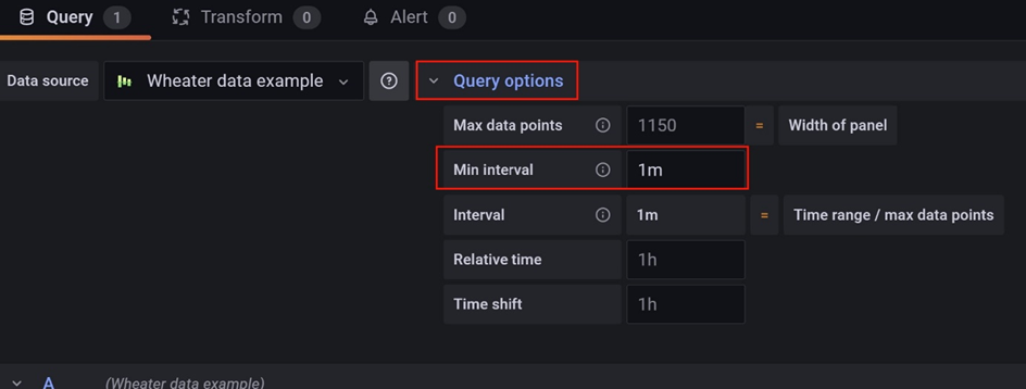
Now I am going to set the duration between each data point. For this example I’ll set it on every minute. This means that every minute we’ll receive newly generated data. In a real scenario this will more likely be dependant on the refresh rate of the database.
We can do this in the query options menu as shown below.
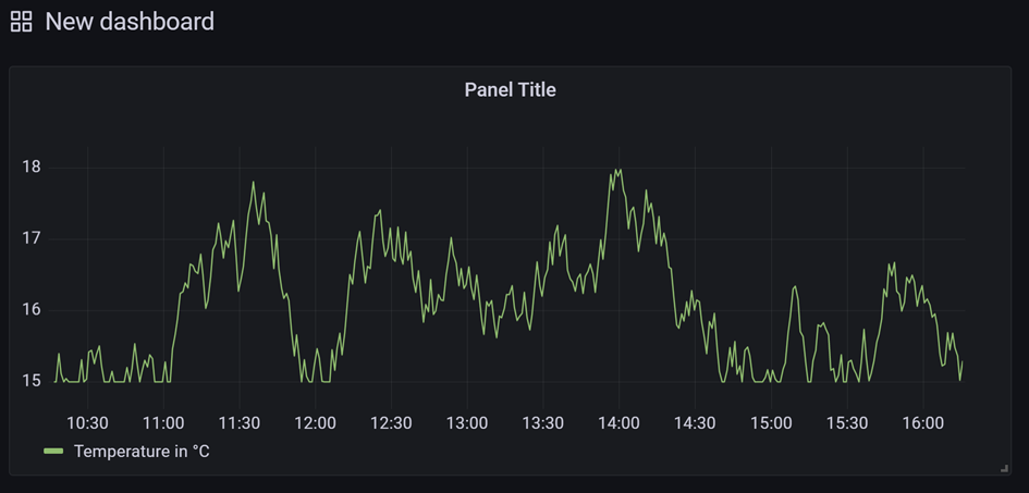
When you now select the ‘Apply’ button on the top right of the screen, the graph will show up on the dashboard we just created.
Now it’s time to change the layout the way we want to create a more appealing visual.
To re-enter the edit menu simply hover over the title and a dropdown arrow should appear with the edit option.
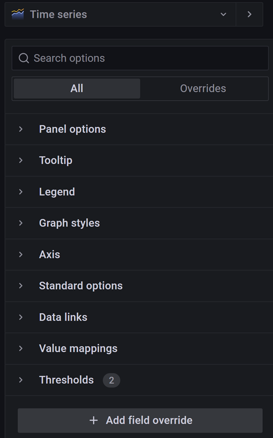
On the right side of the screen there are different menu’s to choose and customize your graph’s.
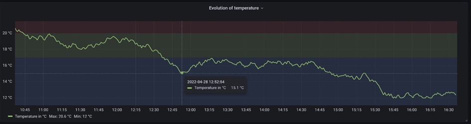
After playing around with the titles, threshold and notations I got the following result.
The last thing we need to configure before the dashboard is fully functional is declare the refresh rate. This can be done in the upper right corner of the screen. Since our data time rate is a minute I am also going to select a minute here.
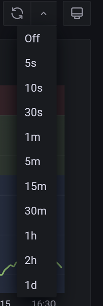
Now the dashboard should refresh every minute with the latest data it can find. The next and last step we need to configure to be able to access the dashboard online in creating the share link.
You can do this by clicking the share icon on top of the page next to the dashboard title. A pop up window will appear with different options to share your dashboard.
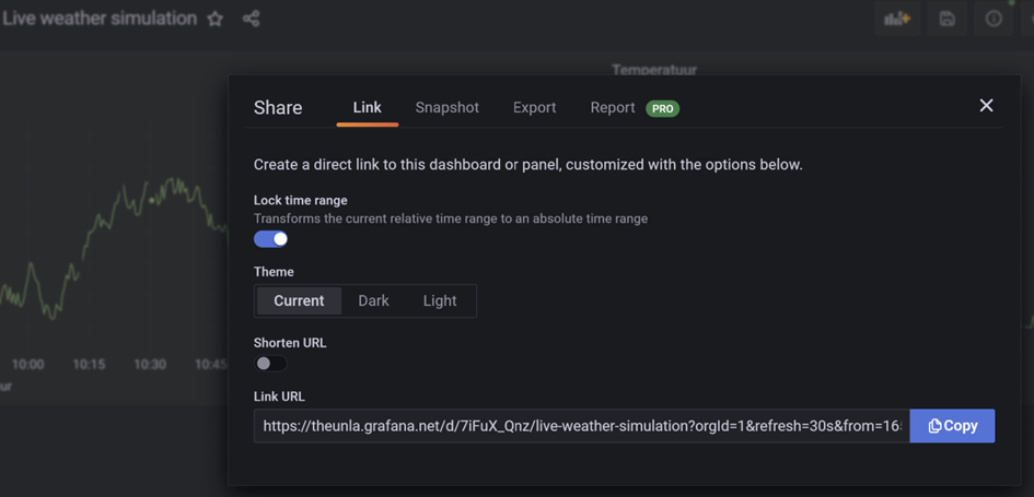
All you need to do now is copy the link and share it with everyone who needs to access the dashboard. You can also create a snapshot or export which will result in an overview of the dashboard of a specific given time.
I hope that with this example I gave you an idea of what kind of data and visualisations you can make with Grafana. For being a free tool with the option to go beyond the paywall for extra functions, it is very complete out of the box.