

“A picture is worth a thousand words“
Henrik Ibsen
This old adage is one of the foundations of data visualization. Images allow us to rapidly convey vast amounts of information to our audience by making use of their lightning fast visual perception. At a glance, we can show that the Sahara Desert really is deserted, and that pretty much everyone in Egypt lives by the Nile River:

Trying to convey such granular information through text would be a challenging endeavour. Still, text can be an invaluable tool in the data visualizer’s toolbox.
How so? Why describe in text what can be shown in a visual?
- Accessibility. Visually impaired people use screen-readers that have a hard time describing what’s in an image if there’s no alternative text provided for the image. Other people who can see just fine might prefer reading things instead of looking at things. Not everyone is equally comfortable with charts and that’s okay.
- Precision. Text conveys precisely what you want to your audience to know. No need to steer your audience’s attention to interesting parts of a visual and hope they draw the right conclusion; the narrative structure of text steers their attention for you.
Microsoft announced the introduction of a new type of “visual” in september 2020: the Smart narrative visual. This visual attempts to summarize a chart into text with the help of Artificial Intelligence (AI).
What am I talking about? Let’s head over to a demo!
Demo of the Smart narrative visual
Imagine we have a store and are interested in how our total sales have evolved over the past 3 fiscal years. The following chart shows we have experienced strong growth:
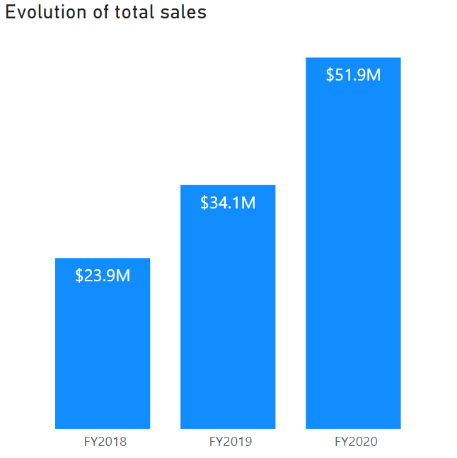
Even without the labels, we can clearly see the upward yearly trend in total sales by comparing the lengths of the bars. But what if we wanted to convey the same information to someone with a visual impairment? Write it out ourselves?!
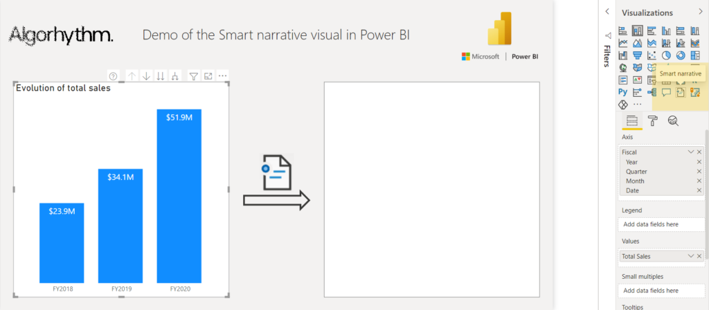
Smart narrative to the rescue! By converting the visual to a Smart narrative, Power BI does the heavy lifting for us and automatically generates a summary of what it thinks is important:
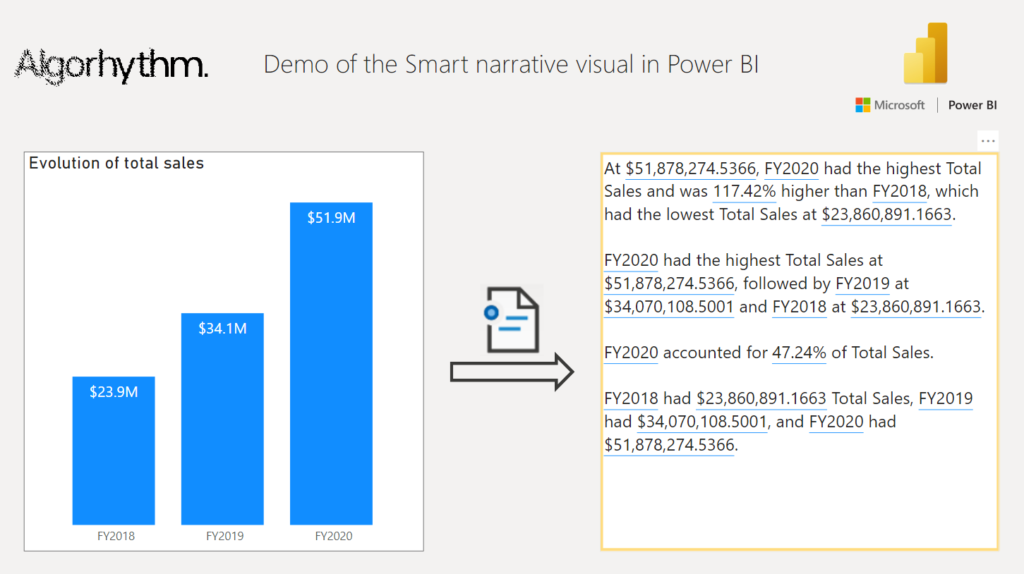
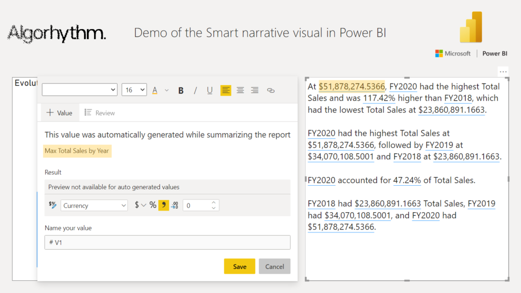
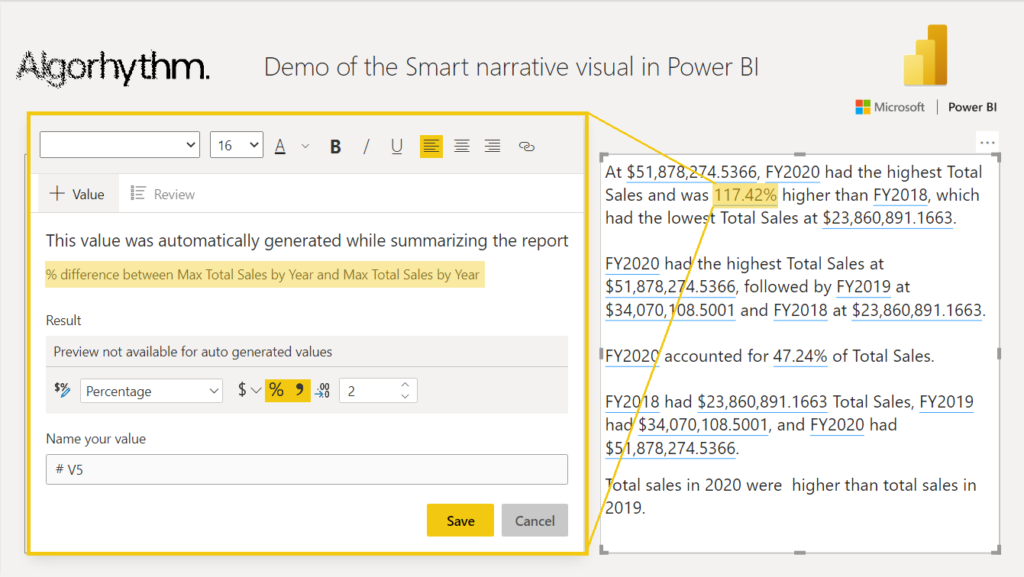
Right off the bat, Power BI provides us with most of the textual description we would want for this visual. Note that values have blue underlining to signify that these are calculated and dynamic, updating when the underlying data changes. How Power BI arrived at these values can be viewed by selecting them:
Suppose we want to know how much our total sales have grown in 2020 compared to 2019. Unfortunately, that’s not included in this automatic summary. Let’s try adding it ourselves based on a similar automatically generated dynamic value:
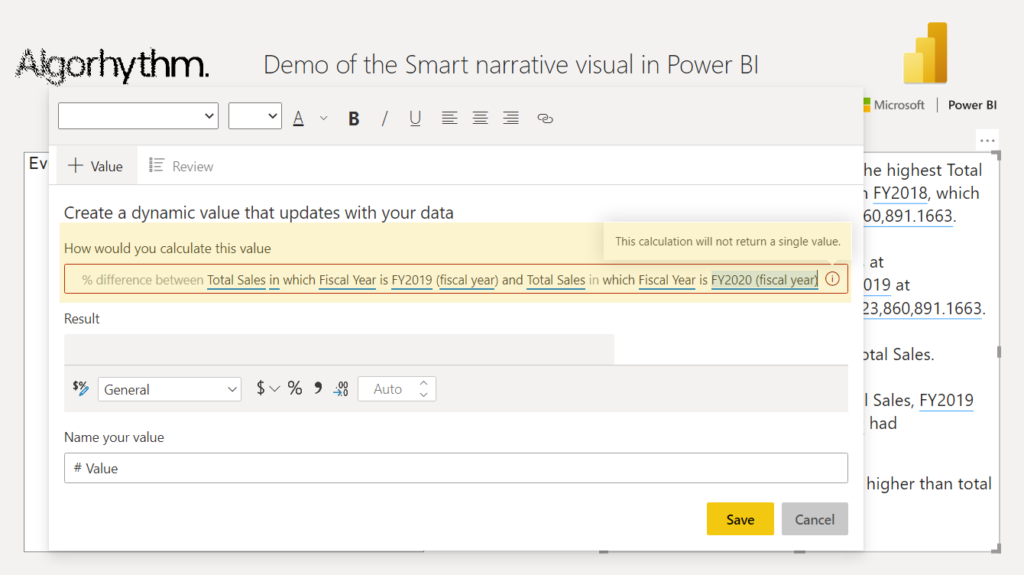
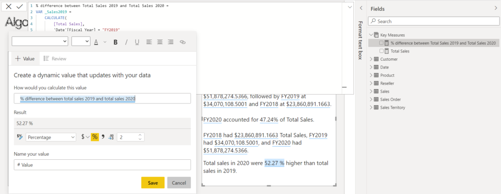
Power BI doesn’t return a value because it can’t make sense of our request, despite using the same “% difference between” language that Power BI itself uses to describe the calculation of the automatically generated dynamic value. Seems like Smart narrative could do with some more study time to understand what users will reasonably ask. Luckily we can still define our own measures in DAX and reference them to be used as dynamic value:
Still, this isn’t as convenient as it could be. Other limitations include:
- no support for other languages than English;
- no renaming or editing automatically generated dynamic values;
- no conditional formatting of dynamic values.
Power BI is continuously improving so here’s hoping rough edges like these get polished out soon.
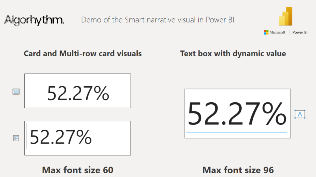
Back to the good stuff. Let’s look at one final benefit the Smart narrative offers: BIGGER font sizes for dynamic text. The Card and Multi-row card visuals can display dynamic text as well, but (at the time of writing) have a maximum font size of 60. Dynamic values in text boxes can go up to 96 in size, a 60% increase to maximum font size of dynamic text!
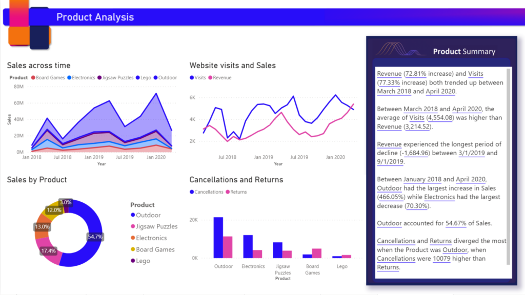
To round off, have a look at how a Smart narrative visual can be used to provide extra context to a Product Analysis dashboard:
Let’s summarize what we learned:
- We can use Smart narrative to convert visuals to an automatically generated text summary and add context to our visualizations.
- Dynamic values in text boxes can be used for larger dynamic text than previously possible.
- We shouldn’t (yet) blindly trust the dynamic values Power BI infers from natural language input. As a workaround we can reference measures until Microsoft releases the SmartER narrative visual 🙂
Happy vizzing!