

Introduction
While I am a visualization specialist, I haven’t been spending much time recently creating data visualizations. I have, however, been tasked with keeping track of the continuously changing design of a development project that will, however it ends up in its final form, require my team to consume, process, and provide data towards our end users. As a result, though I’m not visualizing datasets, I have ended up constantly using my visual skills to provide clear communication and also help rapidly get people up to speed with the current state of things.
The Project
To provide some background on where I’ve found visuals to be very useful, let’s examine who is involved in the work. This project involves multiple technical and business teams located in different regions of the world with different native languages. Our sessions include business specialists, project managers, department managers, developers, engineers, and more.
With such a diverse group of stakeholders, you have a diverse set of backgrounds shaping everyone’s perspectives on all aspects of the project. Some people focus on technical aspects, concerning themselves with operational system logic and developing integrations to ensure everything is up-to-date for the deployment of the new systems. Others are immersed in a physical perspective, thinking about the real-world flows of goods and what is needed to ensure their proper delivery, working to make sure all of this logic will be accounted for in the future. For my team, we try to make sure the information our users require will be present in or be added to these systems flows and that it will be provided to us properly.
The Why
Written Documentation
I imagine most people have experienced situations where they want to investigate a topic, at work or otherwise, and are faced with a massive wall of text or pages and pages of documentation. While thorough written documentation provides a resource that can be continually referred back to and allows people to understand and verify every relevant detail, it has its downsides, especially in a rapidly changing environment.
- It can serve as an intimidating barrier to entry for those who want to quickly get involved – I have to read all of that?
- It can take a while to re-write to account for changes, especially if you want to use it to align everyone’s understanding during a meeting
- To reliably discuss with others, it requires everyone to read and correctly interpret all information presented, and remember it all, which can be tricky especially for complex topics.
Visual Documentation
I have found that using visuals allows me to address a lot of these issues and has created a lot of value for myself, my team members, and other colleagues involved in our work.
- While written documentation still provides every detail, a well made visual can ensure you grasp the most important aspects of a complex topic after an initial walk-through
- Diagramming tools allow you to quickly reroute flows, add notes, or alter other information so that it is easy to adapt them to new information, even while discussing it with others
- As visuals allow the condensation of information into symbols, multiple paragraphs of information can be represented in a single image. Confirming or correcting everyone’s understanding then becomes as simple as pointing at a specific section requiring adjustment or an exception to be noted.
The Visuals
The visuals I have been developing fall under two categories:
- Functional or technical analysis to communicate with my team about what will be required for their work
- Cross-domain analysis to facilitate communication and alignment within the broader project
I want to take a look at some of them, not to wow you with my amazing visual skills or show the most complex insane processes (!!!), but to just show how they ended up making our lives easier within the project.
Functional Analysis – Reference IDs
This is a fairly simple topic, but one where visuals helped out. We had a list of all fields required by our end users in the dataset and we were working to understand what they each represented and where we could obtain them. There were four different reference fields that we kept coming back to (fake names):
- Shipment Reference
- Shipment Number Entry
- Internal Reference Number
- Sub-Message Shipment
These fields were related to each other and were related to information being sent between systems.
We would discuss each with the business, they would check some things, we would update the understanding, and repeat over the course of a few meetings. One point that made this process annoying was that they were in different places in the list file because they were apart alphabetically, so we would often scroll up and down or have to filter when reviewing each to cross-check them.
Because of the close similarities of their names and of their definitions, we would constantly mix them up. So, one day I decided to create a simple diagram showing them within the context as we currently understood them and use that as a basis for discussion.
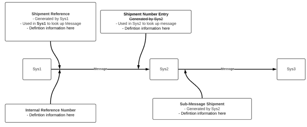
Again, this diagram is nothing special (and has been replaced with fake information), but it gave us a central overview of the 4 references that had been repeatedly confusing for us. It allowed us to:
- understand each in terms of the roles they played in the message flow
- immediately see where each was coming from or where each would be used and what for (if we knew)
- clearly see the overlap between the different fields
In the end, they were actually all the same field being requested with 4 different names. Fun stuff.
Cross-Domain Functional Analysis – Physical, Technical, & Reporting Flow
As the project relates to the development of a system to replace an existing system, there are reports and data which my team is responsible for re-sourcing from the new system or elsewhere as the original one will disappear.
Determining how to do this in a complex environment is a bit of a struggle as the teams are experts in their own domains and the language they use to describe something may completely differ from the language my team uses, even if we’re speaking about the same topic. For example, we may have system1.table1.field1, but the other team may have systemY.tableX.fieldB. We can’t just say “we are using system1.table1.field1, where will that be in the future?” because our team is the only one aware of system1.table1’s existence.
Because of this, we decided we would work to visualize a cross-team/domain understanding of the relevant reports and use that as a basis for discussing with the various teams to determine where we could get the data. We took the understanding we had from previous meetings, created a visual from it, then brought it into a meeting with the multiple teams involved. In this session, we were able to resolve uncertainties on our side, make corrections suggested by the other teams, and come to a mutual understanding of how all of our teams view or interact with processes or data surrounding the report.
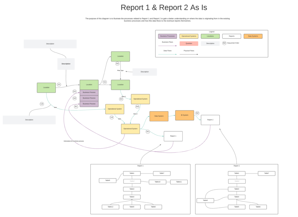
As a result, we know much more than “the report uses data x from system y with filters on it”, we now understand:
- the business processes responsible for generating the data
- which systems this data is originating from
- which systems integrations allow it to flow to our team
- how the data is used within related processes
- which business process the report is used for and how that relates to the rest
With this cross-domain understanding of what we are tasked for delivering, we are in a much better position to find who we need to discuss the data with and ultimately figure out how we will be sourcing this in our to-be architecture.
Considerations for Making Visuals
To conclude, I want to examine some things I find important for making visuals. It’s not enough to just start making pretty pictures, they have to be high quality!
- What is your purpose?
- In the same way that every data visualization should have a purpose, each visual you create should have a purpose. Whether that is to explain a process, communicate a question, or raise concerns about something, that’s up to you.
- Consider your audience
- You will show this to someone, consider what they know, or don’t know, when deciding what to include in the visual.
- Consistency is key
- The more variation of colors, shapes, sizes, fonts, etc. within a visual, the more people’s brains have to work to understand it. Start simple and introduce variation when needed.
- Keep it simple
- Every element you include in a visual must serve the purpose of the visual. If you’re diagramming something and there’s a related process that you decide to include as well, but will never discuss, was it worth it?
- Use a legend
- Make sure every stylistic choice or variation you have in your visual is clearly explained in the legend. You don’t want people guessing what something means.
- Document it properly
- I noticed that in my second diagram, not all information is properly documented as we are still using it as a working document (that’s no excuse I’m sorry!!!). Ideally, you should include when it was created, versions if required, who provided the insights that the visual contains in case people want to follow up further. For this info, I use a consistent header box that I put on every diagram.
- What tool to use?
- Whatever works: MS Paint, LucidChart, draw.io, Excalidraw, Visio, …