

Over the past years, we have had several trainees at Algorhythm. This is a good opportunity for the students to get to know us better. Miguel Haest’s internship assignment was to compare the strengths and weaknesses of each BI tool. Are you curious about the result? You can read his findings & conclusions in the article below.
Introduction
Choosing which tool you want to use in what situation isn’t easy. That’s why during my internship I did some research on the strengths and weaknesses of each tool. In this blog post, you will get a summary of what I think about these tools and when I think you should use them.
The project: BI decision matrix
At the start of my internship, I made a decision matrix. “A decision matrix is a tool that helps business analysts and other stakeholders evaluate their options with greater clarity and objectivity”1. With the decision matrix I hope to give more clarity and insight on when you should choose which BI tool.
In the decision matrix I compare the following BI tools:
- Tableau
- Google Data Studio
- Power BI
- Qlik Sense
- AWS Quicksight
These tools are compared based on the following categories for example:
- Data preparation & modelling
- Interactive dashboards & exploration
- Overall platform
- Pricing
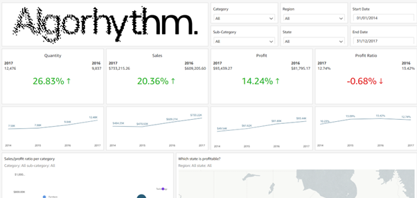
To compare the tools I first did some research, with this research I filled in my decision matrix. After the research was completed, I first made a wireframe of a dashboard after that training was in order to learn each tool. Once I finished training, I started making the dashboards.
Tools
Tableau
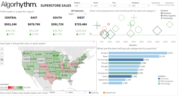
I started my journey with Tableau, before using the tool I was very excited to use Tableau since I read a lot of positive things about the tool.
However, when I started using the tool I realized that tool was a very difficult tool to learn. A perfect example of this is when making tables more specifically trying to make positive profit green and negative profit red. You would think this is an easy task for a tool like Tableau, but to do this I had to search quite long and the functionality is quite hidden. Furthermore, the dashboarding is different in Tableau than the other tools. In Tableau, you make worksheets where you put one visualisation and then after you did that you put your visualisations on a dashboard page. On top of this, the Data modelling of Tableau is very limited compared to the other tools. Unless you use Tableau prep but that is a separate tool you have to pay for.
In the end, I think that Tableau is a good tool if you have a lot of time to make a dashboard and a lot of experience with the tool. However, due to the steep learning curve and the complexity of the tool, I would not recommend this tool for beginners.
Google Data Studio
When I began with Google Data Studio, I did not have high expectations. Since I have read a lot of mixed reviews and it was a free tool I did not expect it to have the same capabilities as the bigger BI tools.
I was however pleasantly surprised by Google Data Studio and its capabilities when comparing it to other tools it was very easy to use and learn. The tool has a very friendly user interface and has the basics visualisations to make a good looking dashboard.
I did start to notice some of the limitations of the tool for example the data modelling is very limited and works differently than in the other tools using data blending, some functions have inconsistent placement in the user interface and the tool offers low customizability to the visualisations, for example, you can’t delete one of the 2 axes of a graph it is either you delete both or neither.
In the end, I think that Google Data Studio is a great tool for starting companies and people who want to take a look at the world of data visualisation.
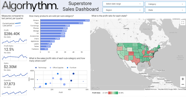
Power BI
Power BI was one of the tools I had already worked with, so I knew what to expect from the tool. When researching, I read a lot of positive reviews about it too.
When I was making the dashboard, I realized that most of the reviews were accurate. Power BI’s similarities with other Microsoft products make it fairly easy to pick up for Microsoft users the most difficult part of Power BI is DAX(expression language of Power BI). Power BI also has really good data modelling capabilities with the Power Query Editor.
One of the notes for Power BI is that it updates really frequently and this makes the product fresh but also makes a lot of its documentation outdated.
Final note Power BI works in most situations its relatively cheap you can make good looking dashboards and it has good capabilities for data modelling.
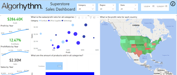
Qlik Sense
Qlik sense is also one of the tools I had already worked with. However, I was still impressed with how good the tool actually was.
Online I read that Qlik has a steep learning curve but was a powerful tool in the end. Although the learning curve was relatively steep, due to my past experience I made the nicest dashboard in Qlik. Except for the data modelling with the data load script, I thought most of Qlik Sense was clear. Furthermore, Qlik felt like one of the fastest tools out of the bunch.
Ultimately I think Qlik Sense is a great tool that I would really recommend to people in the data visualisation world.
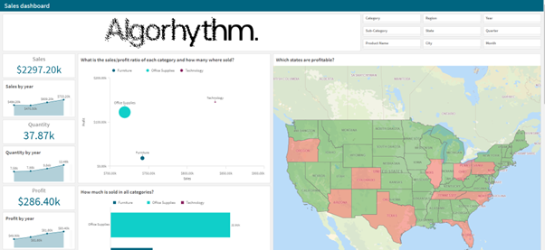
AWS Quicksight
Finally there was AWS Quicksight, this was the tool I knew the least about so I really didn’t know what to expect.
I read online that it was an easy to pick up easy to use tool that could be seen as a cheaper contender to the bigger tools. So I was fairly excited to use the tool. I was however thoroughly disappointed by the tools standard edition. It lacked basic functionalities like text fields, the uploading of images and colouring capabilities. On top of that, it felt like one of the slower tools out of the bunch.
That said are some upsides to using the tool. You can make good looking visualisations and if you are working within the AWS stack no other tool will work as well as Quicksight.
In the end, I think the tool has a lot of potential to grow but has a lot of shortcomings.
In Short
Because of its high learning curve and great-looking visualisations if you have the time. I would recommend Tableau for more experienced users that have a lot of time to work on a dashboard.
Google Data Studio has the basics, is easy to use and is free. Because of this, I would recommend this to beginners and companies that do not have the budget for a BI tool.
Power BI has a lot of computing power, is relatively cheap, works great with other Microsoft products and is constantly innovating. Because of this, I would highly recommend Power BI when working in a Microsoft environment.
Qlik Sense has a lot of computing power, a clear user interface and really good documentation. Because of this, I really recommend this to learn data visualisation.
AWS Quicksight is a cloud-based tool that works well with the AWS environment, this is why I would recommend using it when working in the AWS environment.
Sources
1https://www.lucidchart.com/blog/how-to-make-a-decision-matrix