

At Algorhythm, training is viewed as an essential part of everyone’s development. We think it’s important to keep our colleagues up to date with new standards, technologies, and best practices about how organizations work with data.
Last month, we participated in an exciting workshop about storytelling with dashboards given by Lonneke Opsteegh from StatStories. As the workshop presented some new perspectives on how to view or present data, we wanted to share some of our key takeaways with you so the next report you create will be a success.
User-centered design
It’s important to know your audience. Who will use these dashboards? What is its purpose? What do you want users to do when they check the dashboard?
It is beneficial to take your time to really understand their needs. This can quickly be checked by asking for example the following questions:
- Who are they and what role do they have in the organization?
- How many people are going to use the dashboard?
- How frequently does a user use the dashboard?
- Is your audience familiar with how data is presented through dashboards/charts?
- How can they resist? (for instance: not trusting the data, security issues, … )
After you know who you will present data to, you should determine what data you need to present. What kind of data are you going to show? Maybe you start thinking about working with calculated metrics, geographical data, privacy-sensitive information or you can decide to work with benchmarks or targets.
With the audience and data clear, the question then becomes: what is the best way to present this data? Is the audience interested in totals or do they prefer the percentage of change against another period? Or just showing the variance between two years within the same category. These are all different variations to show the need. Next to the variations, you also have different kinds of data. For example percentages or absolute values. Also, time ranges are very popular to show for example evolutions.
Now we know all this information, we can start thinking about user stories that capture all the information and can be used as input for our dashboard at a later stage. A user story is a short, simple description of a feature. They typically follow the structure: “As a < type of user >, I want < some goal > so that < some reason >”.
Dashboard design
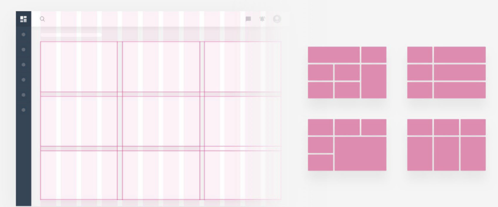
A key first step to building a dashboard is selecting your graphs. There are a few important considerations in this step: consider the right graph for the task, use your space wisely, use clear & direct graphs so they are understandable for end-users, and be wary of visually impressive charts that look cool but are too complicated. Choose wisely for the specific message and the audience!
During the workshop, we received the following links to help pick the right visualization at the right moment. When you’re not sure how to proceed, think about what you are trying to show and take a look at their suggestions. In this blog, we will not go into detail about the best practices mentioned in these references. 😊
https://chart.guide/charts/chart-choosing/
https://datavizcatalogue.com/blog/chart-selection-guide/
http://sql.bi/visual-reference
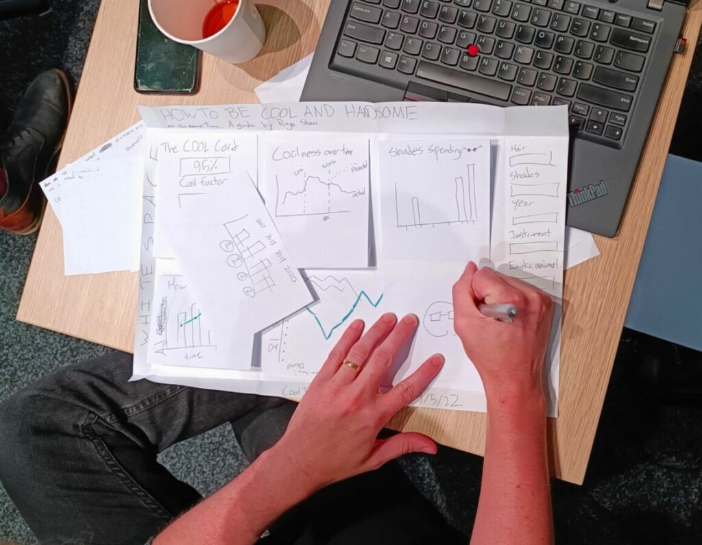
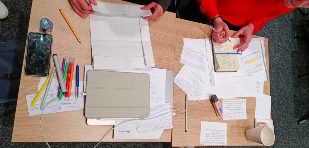
Another great tip Lonneke gave us: draw the graphs (in a basic way) on paper. It’s very easy to define the logic and see what it will look like if you put all the information together. Paper sketches can help define your end result much easier and quicker than building everything in a BI tool. These sketches are also a good reference for discussions with the end users about how you see the visualizations. For them, it will be a lower barrier to move or adapt the drawings or create a basic one themselves to make clear what information they want to see and how.
Dashboard layout
I always knew that alignment is important to avoid a messy dashboard. What I didn’t know was that you could check this by folding your paper (thanks Lonneke for this great tip!).
Take a large paper to create a layout of the dashboard. You can reserve a border at the top for your title, buttons, … and a border at the bottom for a logo or last refresh date for example. It’s also possible to fold a column at the side for filters. The space that’s left will be used for the graphs and other content.
That approach gives you nice and symmetric blocks to work with. In the previous steps, you created visualizations on small cards. These cards can you use now and give them a place on the larger paper.
You get a great overview of what the dashboard will look like.
Other tips and tricks for a good dashboard layout is using consistency in titles, decimal notations, fonts and sizes but also try to limit the number of different colors
Storytelling & user experience
Finally, we know how and what we are going to visualize. All the questions are answered and we can start creating a dashboard. Hereby, it’s important to look at the style of communication used by your customer.
This can be checked by going through their website for example. What do you see here, do they use specific colors, rounding, quotes, images, or do you get a specific emotion/feeling by visiting the website? You can re-use this style in the dashboard.
The following items can help you improve the user experience.
- Add alerts at the top of the dashboard to give quick insights
- Clear and easy-to-use navigation so visitors don’t get lost in the dashboard
- Icons can help you give a nice feeling looking at the dashboard
- Make sure that the filters are at the right spot and filtering the right visualization
- Tooltips are really useful if you have extra (secondary) information which doesn’t need to be visible at the first sight.
- Lastly, make sure that you have titles and text to guide the user through the dashboard.
There are more tips and tricks for sure. These were the ones we looked further into.
Thank you
Thank you Lonneke for giving this workshop.
All of us had a great time and we learned new tips and tricks.
We can’t wait to show off our new insights in order to make our customers even more satisfied.