
Introduction
In my previous article, Contextualizing Visualizations , I laid out my perspective on why you should consider the context in which you present your visualizations. There is no one best-way to do this, but one method I showed was to embed the actual charts visualizing the data within a graphic representation of the process that the data related to. In this article, I’d like to give a quick behind-the-scenes on how exactly I accomplished that in Tableau.
Understanding the Process
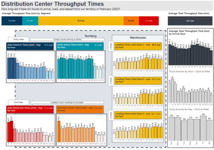
The first step of this project was to gain an understanding of what the real-world process was behind the data. In this situation, the data represented a flow of trucks at a warehouse:
- Empty trucks arrived at the gate of the warehouse territory
- Trucks were checked in by gate security
- Trucks drove to loading dock to pick up shipment
- Trucks drove to exit gate
- Trucks were checked out by gate security
- Trucks departed to deliver shipments
This is a fairly simple flow and the sequential nature of it gave me an easy opportunity to start looking at lead times and potential bottlenecks in the process.
Diagramming the process
This can be done in any tool you prefer whether that’s Photoshop, Microsoft Paint, Illustrator, LucidChart, Draw.io, whatever you want!
My diagram went through multiple iterations but where I ended up was the image below.
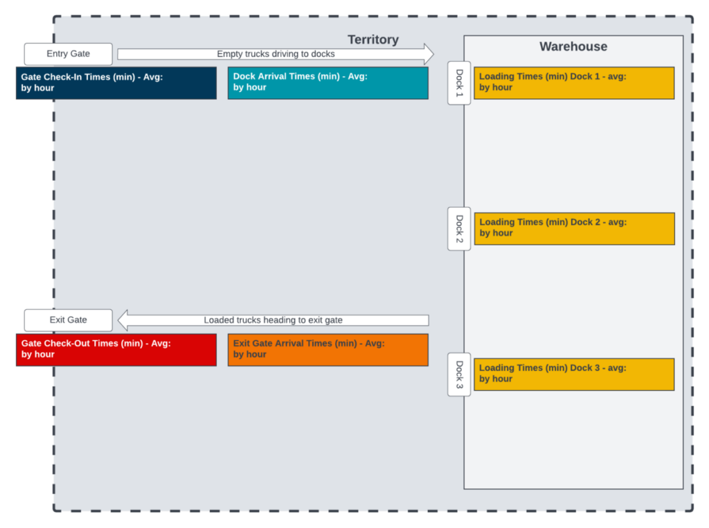
A few notes:
- Each step from the data is shown as a step on the diagram
- The colors of each step are the same colors I used in the various sheets / charts in Tableau
- I added descriptive information to help the viewer understand the relationship of each step to the physical locations in the process
- I ended up creating titles for each visual in the diagram rather than Tableau because it granted more flexibility
- I did overlay charts into the titles so the “Avg: ” would have dynamic numbers associated with them
Visualizing the data
Layout
To visualize the data, I chose to use visuals embedded within the process diagram to show data relevant to each step of the process and to use visuals outside of the process diagram to show data related to the entire process.
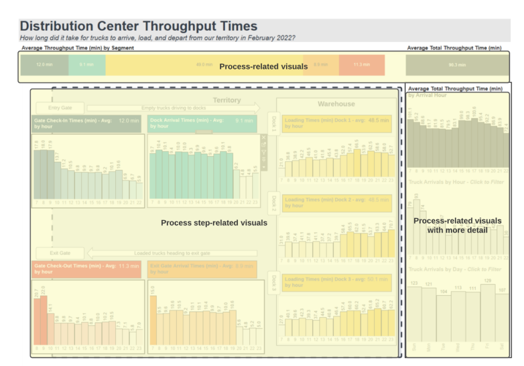
I did this to show the details of each step, but also to show the story of the impact of each step on the overall process. Visually, as the process flows starting from the entry gate in the top left -> to the loading docks on the right -> down to the exit gate -> and left out of the exit gate, I placed the process-related visuals on the top and right which were outside of that visual flow.
Technical placement
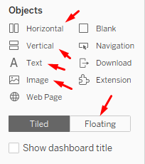
To arrange the charts in the way that I did, I used a combination of images in the dashboard, horizontal and vertical containers, and floating charts.
I started with adding in the image then made space around it for the overall charts and title. It did take a bit of time and, as I worked on the charts and changed around KPIs and formatting, I went back to redesign the diagram a few times to do things like adding the titles to each chart, aligning things to work better with the chart sizes, and better arrange the process diagram.
Chart Choices – Overall Goal
In terms of specific chart choices, I wanted to see what bottle necks occurred in the process and if they were related to specific times of the day and tried to choose charts which would reflect this.
Chart Choices – Bars for Averages by Hour
I re-used this same bar chart for each step and on the top right for the average total throughput time per hour:
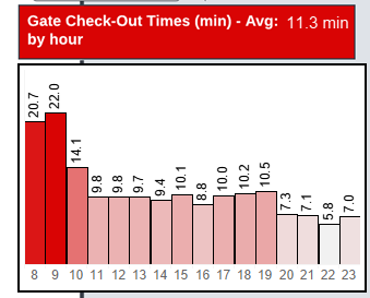
I figured the vertical bars arranged by hour would allow end users to interpret the data and see trends throughout the day.
Because the charts needed to be small, I did forego axis titles which always creates a risk of things being unclear. To address this I tried to include descriptive titles to show what the numbers on the chart indicated: “Gate Check-Out Times (min) by hour“. The “(min)” describes the values of each bar and the “by hour” describes how each bar is split grouped by hour.
One criticism I now realize is that a better title would have been “Average Gate Check-Out Times (min) by hour”, because it is not clearly indicated that these are averages.
Chart Choices – Filter Bars
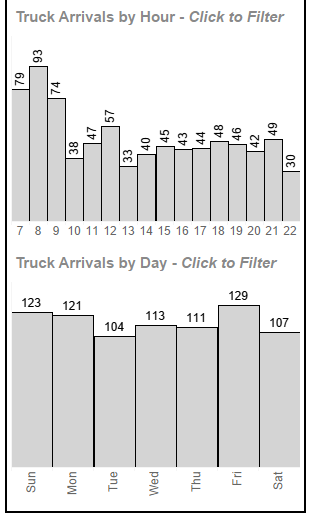
I added these two bars and distinguished them from the others with their titles and colors. My hope was that users would see the call to “click to filter” and start exploring the data to see what happened to the trucks who arrived on a specific time or day.
Once again, I am relying on the titles to cover what is shown in the visuals “Truck Arrivals by Hour” and “Truck Arrivals by Day“.
Chart Choices – Header totals

These simple horizontal bar charts were used to show the overall picture of the process and allow a comparison which is not easily made with the detail bars. As the axis of each of the detailed bars is different (see below how the two indicated bars are the same height, but the dark blue check-in times are almost twice as long), it’s not immediately visually apparent how the different steps differ in time.
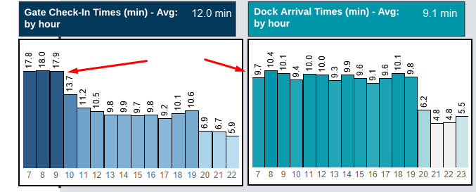
By providing the breakdown of the total throughput in the header bar, we can see clearly how loading (yellow) is the step with the longest average duration.
Conclusion
My goal here was to break down some of the considerations and tools I used to contextualize data within my dashboard. If you were interested in the concept and wanted to try it out on your own data, I hope this article has helped guide you on how you can approach this.