

You maybe think: Creating dashboards is easy. But there is a difference between creating a single dashboard in a single style and creating several dashboards in the same style. For our client we were making business dashboards that are in the branding of the client. So every dashboard needs to be in the same colors, typography and the visualizations (graphs) must look the same. Also we must keep in mind the visualization principles: always use the appropriate visualization for the data you are showing. These different aspects makes it sometimes a problem to create coherent whole.
The problem
In the beginning, making dashboards in the same colors, typography and visualizations (bear in mind the visualization principles) sounded easy. We started with an empty Tableau workbook and made some dashboards as requested. These dashboards where approved by the end users. After this approval, we started again from scratch with a new workbook for another dashboard. But we noticed that our second workbook with dashboards didn’t look exactly the same as our first workbook with dashboards.. Sometimes the colors were different, or we didn’t remove some axis and unnecessary lines in some graphs. We had to check every single visualization to make it the same as in the first workbook we made.
First try
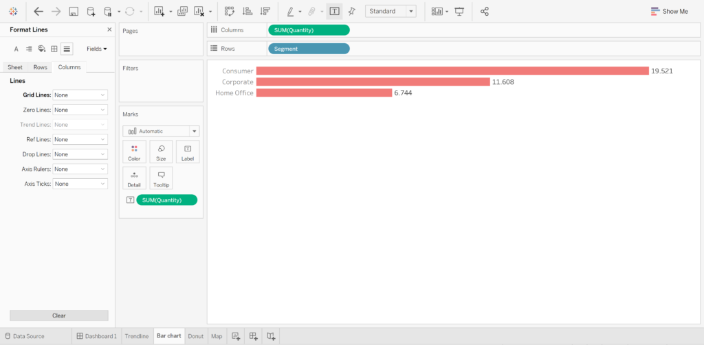
We needed to come with a solution. Comparing all the dashboards was very time consuming. So we decided to create some documentation with all the steps we had to follow to set up a dashboard in the correct style and with the correct graphs. In the documentation we captured the visualizations which we use the most like a bar chart, line chart, donut. Secondly, we described some other elements like text, buttons, containers,… For every graph or element we’ve listed all to steps in order that the developer knows where to pay attention. But this wasn’t yet what we want. There was a minimum of time difference and we’ve still forgot some steps.
A solution that works
Since we needed to win some time, we took a step further and created a template workbook. The first step was to create some dummy data in excel. We uploaded this data in a workbook. Secondly, we created a first sheet named “bar chart”. We followed our documentation till the bar chart looked like we wanted. We did the same for all the other visualizations and elements. As a result, all the visualizations and elements had their own sheet which was in the correct style.
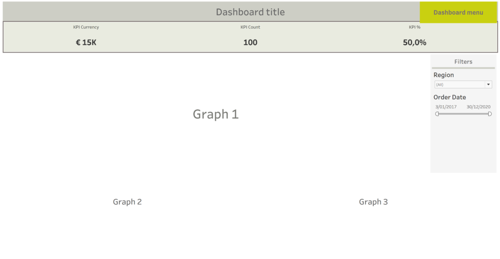
We even create a default dashboard look with a dashboard title, menu options, KPI’s and filters. When everything was done we’ve saved the workbook as our “template workbook”.
When there is a new request, we use this template workbook for the new dashboard. We just need to open and save the workbook with another name. Add a new data source and replace the dummy data and we’re ready to start. We can use the visualizations and elements, we can adjust them when necessary and copy the sheet when we need more of the same.
With this solution we can create dashboards that are visually interesting, without always need to pay attention to all the steps. With the benefit that we are working faster and better.