

Introduction
What is multicollinearity?
Multicollinearity is when two or more features are correlated with each other. Although correlation between the independent and dependent features is desired, multicollinearity of independent features is less desired in some settings. In fact, they can be omitted as they are not necessarily more informative than the feature they are correlated with. Identifying these features is therefore a form of feature selection. As a Data Scientist, it is key to identify and understand multicollinearity in a dataset prior to training predictive (regression) models. And even after having trained a model, it is important to limit highly collinear features as it can lead to misleading outcomes when explaining models.
Why visualize multicollinearity?
Checking the correlation between the independent and dependent features is typically done during an exploratory data analysis. It can provide an early insight towards feature importance and thus a good understanding of how informative the features will be to do prediction. For feature selection, you do not have to necessarily visually inspect correlations between features. You can use metrics such as VIF (Variable Inflation Factors) to detect multicollinearity. However, it can still be worthwhile to visualize correlation between features as a means of extracting insights about the features of the dataset.
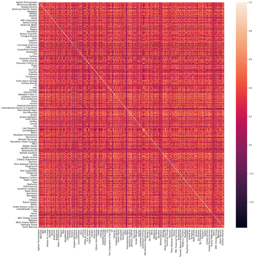
Correlation between features is typically visualized using a correlation matrix which in return is visualized with a heatmap showing the correlation factor of each feature in the dataset. Unfortunately, if the dataset has a large amount of features, then all a heatmap may do at that point is draw a nice 8-bit artwork. It can be incredibly difficult to extract any type of information because of the sheer size of the resulting heatmap. With 50 features, that’s a matrix with a shape of 50 x 50 (Duh²). Colors and intensity may help to distinguish the most important factors, but that will be about it. Surely, there must be a better way.
In this blog, I present three ways to visualize multicollinearity. Namely, the de facto heatmap, the clustermap and the interactive network graph visualization. I will highlight the pros and cons of each visualization.
Note: With R (and the igraph package), you can easily generate the “correlation network” diagram. However, with Python, there is no set way to the best of my knowledge.
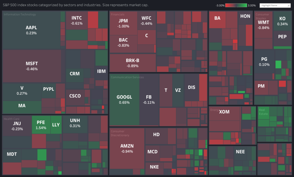
Visualizing strongly correlated stocks of the S&P500.
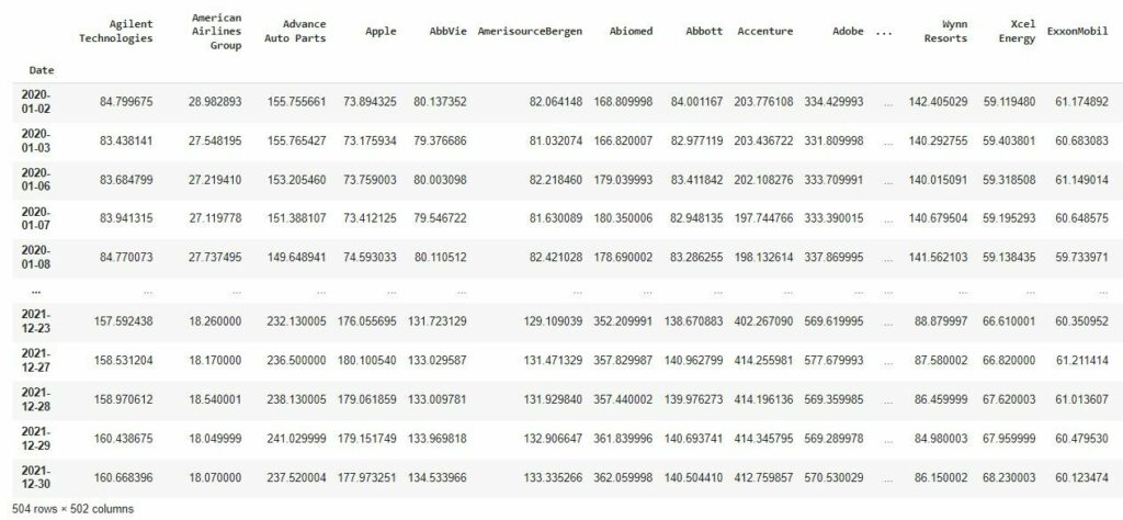
I will use the S&P500 stock data (between 01/01/2020 and 31/12/2021) to visualize collinear stocks. With the yfinance package, you can simply retrieve the stock market data using the stock ticker symbols. Prior to retrieving the stock data, the S&P500 stock table is scraped from Wikipedia to retrieve all current stock information in the S&P500. This includes the names of the stocks, the tickers, the corresponding sector, and more.
Although I specifically work with time-series data in this blog, the proposed visualizations are data-agnostic. All you need is the correlation matrix of the resulting DataFrame generated with the Pandas function .corr().
The heatmap
The correlation heatmap can simply be visualized by generating the correlation matrix with Pandas and plotting the heatmap of the matrix using Seaborn. The result is a heatmap showing the positive, negative and zero correlation factors. The main advantage of the heatmap is that it can be generated very easily with Seaborn. The colors help to distinguish strong and weak correlations. The main drawback is that does not scale well with the number of features. It can be hard to interpret when the number of features is large. The features that are strongly correlated are not grouped, as the order is arbitrary. Moreover, the resulting matrix is symmetric, which means half of the values shown are redundant. The upper/lower triangle of the matrix can be removed with a few extra steps.
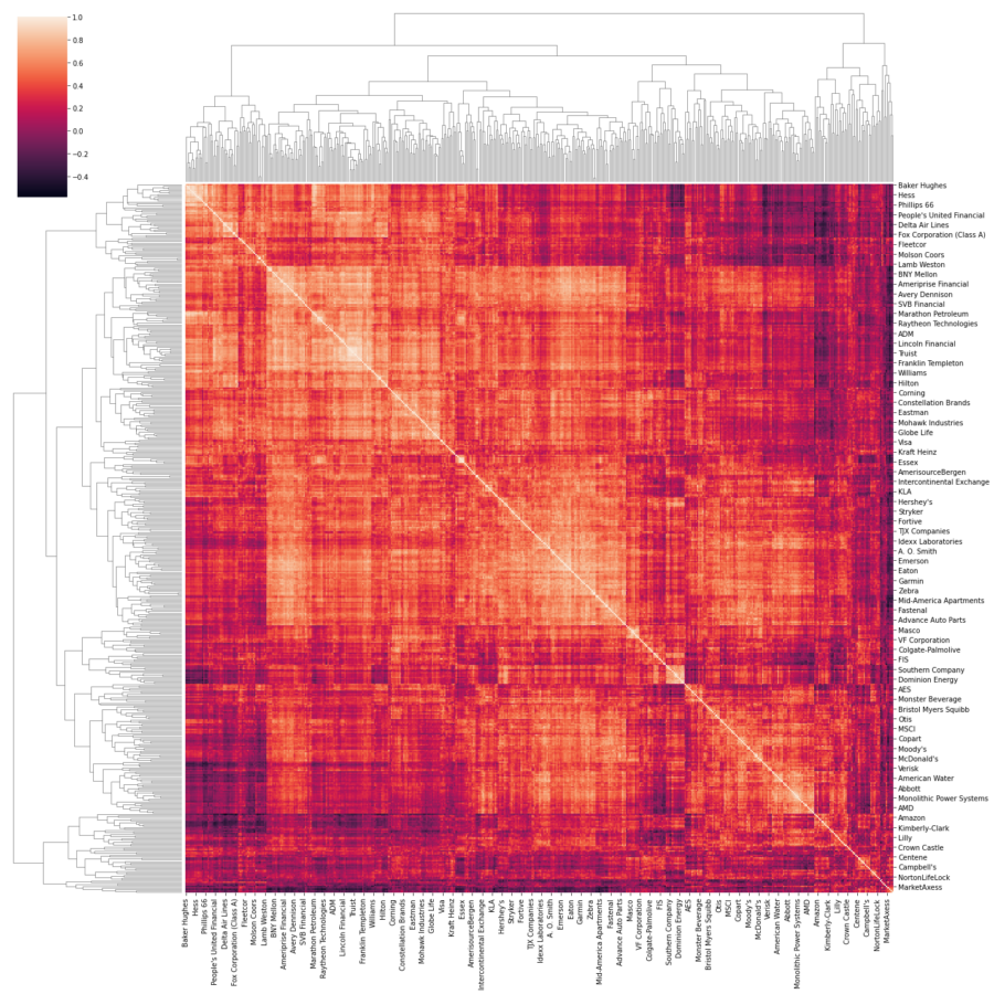
The clustermap
At first glance, the clustermap is mostly similar to the heatmap. It is equally easy to plot. However, it clusters features that are strongly correlated, and shows the tree to understand the clustering on different levels. Unlike the heatmap, the order in which features are sorted serves a purpose. Other than that (and the extra clustermap), it is visually similar to the heatmap. The clustermap is an adequate way to visualize groups of features that are strongly correlated. That is, if there is a limited amount of features in the dataset. Otherwise, the clustermap can get equally confusing to interpret when inspecting collinear features.
The network graph
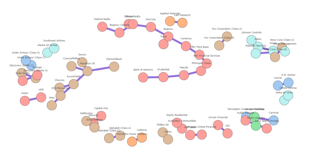
I proposed two ways to visualize multicollinearity. That is, using the heatmap and the clustermap. Although the latter was an improved way to visualize group of features that are strongly correlated, it can get very tiresome to interpret or can get awkward to retrieve insights from, especially if the number of features is large. This is especially the case with the S&P500 dataset, which contains more than 500 features and even more if you consider a longer timeframe or other NYSE exchanges. The biggest issue with these types of visualizations is that it shows redundant information. In other words, it shows features that are also weakly correlated. We are usually interested in strong correlations and plotting weak correlations is just not that interesting. Another major drawback is that the visual space is not used wisely. It is hard to tell where one group of features begins and when the other ends, and most importantly, how clusters of features are correlated with other features. There is a lot of information that is lost or difficult to distinguish.
The network graph can alleviate most these issues. Below, it is generated using the networkx package. Using networkx and Plotly, we can create an interactive plot. In order to limit the number of interconnections between collinear features, only the Maximum Spanning Tree is taken. You can play around with the slider to increase the minimum correlation threshold which will evidently result in less stocks. I have also plotted stocks with the same sectors in a similar color. You can easily see how stocks are grouped according to their sectors.
You can find the code to reproduce the visualizations in the following Colab notebook.
Summary
Heatmaps are a quick and easy way to display correlation between features. For larger datasets however, it can become increasingly complex to interpret information. A network graph has the greater advantage in that it groups correlated features together, and only shows the necessary correlations. That is, above a specific threshold. Unfortunately, there is no quick and easy way to generate the network graph of a correlation matrix other than using networkx (or other graph libraries) to generate one. More experimentation with graph layouts is needed in Plotly to ensure enough space between nodes and node clusters such that the resulting graph is easy to read/interpret. Maybe in the future, this will be a standard visualization of Seaborn. Until then, we’ll have to be creative.
Thank you for reading. Good luck!
Sources
- https://statisticsbyjim.com/regression/multicollinearity-in-regression-analysis/
- https://www.analyticsvidhya.com/blog/2021/03/multicollinearity-in-data-science/
- https://pandas.pydata.org/docs/reference/api/pandas.DataFrame.corr.html
- https://seaborn.pydata.org/generated/seaborn.heatmap.html
- https://seaborn.pydata.org/generated/seaborn.clustermap.html
- https://networkx.org/
- https://www.r-graph-gallery.com/250-correlation-network-with-igraph.html