

Part 2 – The use of the confidence interval in real-life examples
Introduction
Welcome to the confidence interval blog part 2. In this blog I will focus on the practical use of the confidence interval by explaining how to interpret the factors that have an effect on the interval. It’s important you have a good grasp of the definition of the confidence interval. If you are struggling with the definition or having difficulties remembering what the interval stands for, please visit the previous blog here before you continue. In the first part I explained the confidence interval as easy as possible.
So how should you use or interpret the confidence interval in real-life use cases? This blog is all about answering this question by zooming in on the factors that control the confidence interval. My goal is to get you confident (pun intended) in interpreting and presenting the confidence interval via your favorite BI tool.
Before we dive in, I want to clarify that my focus is on how you, as a data professional, can make the results clear to the stakeholders. My focus is not on how to calculate the confidence interval in a specific BI tool such as Power BI or Tableau. The latter is a more technical approach which deserves its own article.
Factors that influence the confidence interval
First, let me give a short recap of what the confidence interval is. The confidence interval tells us something about the point estimate (= sample based results) in relation to the true value (= population based results). The values within this interval are normally distributed with the point estimate in the center. With a certain confidence level, we can state that the true value lies somewhere in this interval around the point estimate. The distance from either boundary to the point estimate is the margin of error. The larger the interval or the larger the margin of error, the more uncertainty about the true value exist.
Ideally, you want the confidence interval as narrow as possible or in other words you want the margin of error as low as possible while retaining a high confidence level. While having a high confidence level, the smaller the interval, the closer the point estimate will be to the true value. So the meat of the matter is: for a certain confidence level, the more narrow the interval, the better. And the question follows: how can we control the interval? Well, the boundaries of the confidence interval are influenced by:
(a) two main characteristics of the sampled data
- the variation of the data (eg. standard deviation)
- the size of the sample
(b) the confidence level
The variation of the data
The confidence interval is only applicable for continuous data. This type of numerical data consist of different values. Measures of variation such as the standard deviation point out how far away the values of data points are from each other. If the data is more spread out, the data has more variation.
The variation of the sampled data has an isolated effect on the confidence interval. Let me show you this effect with the same example from the first blog. The bar graph below shows the average % internet users across years in the period 1980 – 2010 for three income groups (high, middle, low). For each income group a confidence interval with a confidence level of 95% is calculated and visualized with a vertical line.
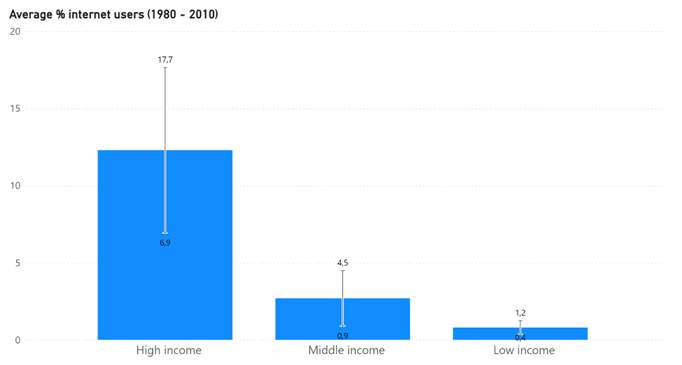
Regarding the confidence interval, we can observe that:
- The absolute margin of error for the low income group (0,4%) is remarkable smaller in comparison with the high income group (12,3%)
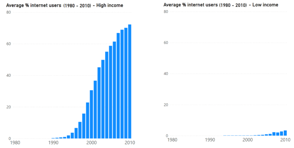
The difference is caused by a lower amount of variation of % internet users across years for the low income group in comparison with the high income group. We can assume that people with low income don’t easily get access to internet for the first time, especially in the less technology advanced countries. The adoption of internet for this group was indeed occurring much slower in comparison with people with high income. From 1980 – 1990, internet was only for the selected few with high income. After 1990, the high income group adopted internet much faster which causes more variation in yearly results in comparison with the low income group. Both graphs below confirm these assumptions.
For the high income group the confidence interval shows more uncertainty about the point estimate in comparison with the low income group because the margin of error is higher. For the high income group we are 95% confident that the true value is somewhere between 6,9% and 17,7% while for the low income group the true value is somewhere between 0,4% and 1,2%. We can attribute this effect to the higher variance in data for the high income group.
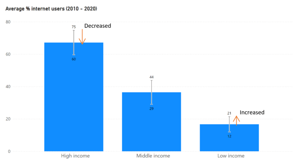
If we look beyond 2010 then we can assume that from 2010 to 2020 the rate of adoption of internet for the high income group slowed down. Also we can assume that the opposite happened for the low income group. Both of these effects seem to be confirmed by the change in margin of errors for both groups as shown in the graph below. The absolute margin of error for the high income group is decreased to 7,5%, while for the low income group the margin of error has increased to 4,5%.
However,… important to note down is that the difference between the confidence interval from the 1980 – 2010 data and from the 2010 – 2020 data, can’t be attributed alone to a difference in variance. Another factor plays a role. You may have noticed that 1980 – 2010 data has more years and thus more datapoints than the 2010 – 2020 data. This is a key difference. The amount of datapoints aka the sample size is the second factor that controls the interval.
The sample size
The sample size is also important to consider. The size of an unbiased sample determines how good the data reflects the population. If the sample size is increased, while keeping the variation the same, then confidence interval will get smaller because the data starts to reflect the population more. So the golden rule follows: the bigger the sample size, the better.
The variation of the data and the sample size both influence the interval separately. If we return to the % average internet users across 2010 – 2020 in comparison with the period 1980 – 2010, then the increase of the absolute margin of error for the low income group can be attributed to a combination of higher variation of data and a smaller amount of datapoints. The decrease of the absolute margin of error for the high income group however is the consequence of less variation in the proportion internet users across 2010 – 2020. If we only looked at the sample size for this income group, we would expect a wider interval. The effect of the decrease in variation counters the effect of the change in sample size.
From a practical point of view it is often easier in a research design to increase the sample size then to decrease the variation. More on this in the next article where I critically discuss the positives and negatives of the confidence interval. Now we move on to the last but not least influencing factor: the confidence level
The confidence level
Finally, the confidence level is inseparable from the confidence interval. The data analyst must decide how much of the normal distribution around the point estimate will be considered in the analysis by setting up a confidence level. The higher (resp. lower) the confidence level, the more (resp. less) confident that the true value is caught. Lowering the confidence level means taking more risk. How the risk manifests itself is dependent on the research case. In some cases, each change in measurement unit is crucial. Take the following analysis as an example: predicting the number of victims of mass shootings in USA for 2023 using two different confidence levels.
In the below line graphs, the total amount of victims of mass shootings in the USA is presented for each year in the period 1982 – 2022. The outlier “Las Vegas Strip shooting” has been omitted from the analysis. Also shown is the trendline with the prediction of the number of victims in 2023 to 2028. These predictions are the point estimates. The grey zone around the point estimate is the associated confidence interval. The first graph shows a confidence level of 75%, the second graph shows a confidence level of 99%.
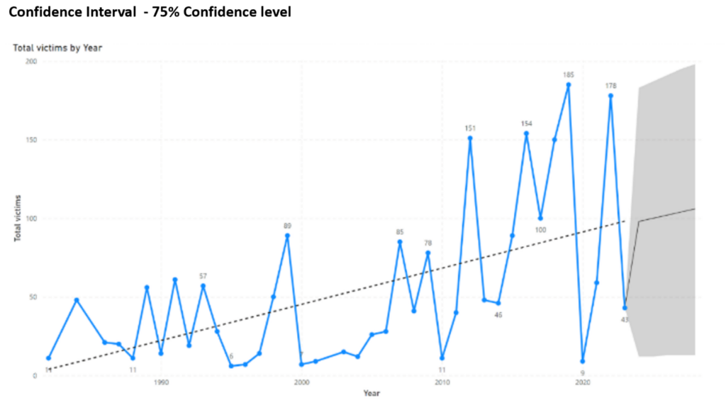
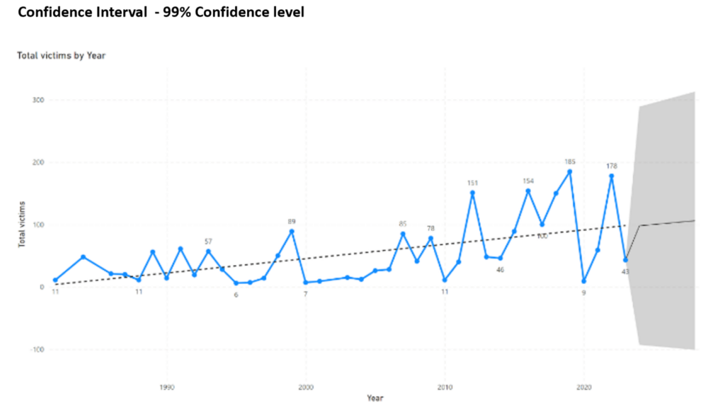
Following the graphs, the prediction of the amount of victims for 2023 can be formulated in 3 different statements.
According to the predictive analysis, …
- the estimated total amount of victims in 2023 will be equal to 99
- we can be 75% confident that amount of victims in 2023 is between 11 and 179
- we can be 99% confident that amount of victims in 2023 is between 0 and 290
Which statement would you prefer to base actions on? In my opinion, the first option doesn’t tell the whole truth. The second statement is to optimistic. A 75% confidence level implies 25% chance of error. We all can agree that there should be no room for error in case of human lives. Therefore a 99% confidence level is the safest decision. It is a standard practice in human sciences to use 95% or 99% confidence level. More on this in the third and final chapter of this 3-part article.
Conclusion
Using and communicating the confidence interval in a clear manner, implies knowing what confidence interval is and how it is build on the basis of the sampled data. In this part, I focused on the main building blocks, which are: the variation of the data, the sample size and the confidence level. The variation of the data and the confidence level both have a positive relation with the margin of error, while the sample size has a negative relation with the margin of error. I hope I have made clear what the precise effects are of these influencers. In third and last part, I will shift my focus to the business value of the confidence interval.